This week’s Top 10 Tuesday is book cover redesigns that I either loved or hated. So when I looked up all the covers that I knew had been redesigned I found that I mostly loved all the changes that were made.
So this is my 10 Book Cover Redesigns that I Loved:
Genuine Fraud by E. Lockhart – I think these are both striking but I personally love the plain cover with the blue background and the pieces of cut hair. I think it works so much better with the premise of the book and intrigues me so much more than the smudged face.


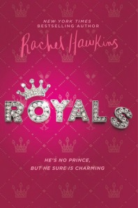
Royals/Prince Charming by Rachel Hawkins – I’ve spoken about this cover a few times on my blog but this was the perfect opportunity to say what a great job they did with the new concept for the cover/title of this book. The Royals cover just looks tacky and juvenile and I am drawn so much more to the Prince Charming!

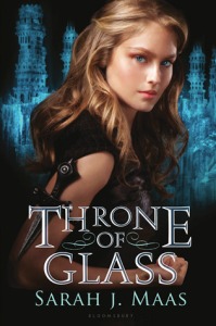
Throne of Glass by Sarah J Maas – I never liked the original cover for Throne of Glass! I always thought she just didn’t embody who Celaena is. She just looks too innocent and docile to me, the illustrated version is sooooo much more aesthetically pleasing to my eyes.

An Ember in the Ashes by Sabaa Tahir – as much as I love the original cover the other two books in the series don’t match it and it is soo frustrating to have them next to each other on my shelves being all different sizes and colors. Which is why I think I prefer the new paperback editions as they all match!


Flamecaster by Cinda Williams Chima – similar to An Ember in the Ashes, I quite love the original cover for Flamecaster, but the rest of the series match the new cover which make me more inclined to like it more because they all match.


The Girl of Fire and Thorns by Rae Carson – I’ve always thought the original cover for this was a little too busy. There’s a whole lot going on and it all just looks a little unfocused. However, the new paperback edition is clean and still in keeping with the concept of the story so I like it a lot more!


Vampire Academy by Richelle Mead – This is an example of a little change with a big impact. Have the VA overlapping the face with the color change is so much more effective in my opinion. The original cover doesn’t really age well either.


Shatter Me by Tahereh Mafi – When I first seen the new cover for Shatter Me I thought it was beautiful and so much better than the original. I thought it was highly original for the first 3 books and then as she kept releasing more they all started to look a little too similar.


Undead Girl Gang by Lily Anderson – I actually love the first cover so much. I thought when it first came out that it looked super original and very pretty, but it doesn’t really give any indication of what the book is really about so I can appreciate the new cover more, especially when Mila is front and centre!


Vicious by V.E. Schwab – There isn’t particularly anything wrong with the original cover of Vicious, but I just love the new edition so much more! Its simple yet effective and had I never heard of this book before I would immediately pick it up just because of the cover!


Nice list! The redesign on Vampire Academy does make a big difference! I also like the redesign on Vicious. I haven’t read it, but I’d love to read some V.E. Schwab. Here is my Top Ten Tuesday.
LikeLiked by 1 person
All of V.E Scbwab’s books are amazing!! Highly recommend 😊
LikeLike
I get so frustrated when I already own a book in a series and then they do a cover re-design. Like, what!? I also have the first cover design of Ember in the Ashes and now I am too distraught to buy the rest of the series because it won’t match!
What a great idea for a post! Loved it!
LikeLiked by 1 person
Isn’t it the worst!! 🙄 thank you!
LikeLike
Yeah, that redesign for Vampire Academy was a great one!
My TTT.
LikeLiked by 1 person
I have to agree with you on the Vampire Diaries. I have the old cover and I’m not a fan
LikeLiked by 1 person